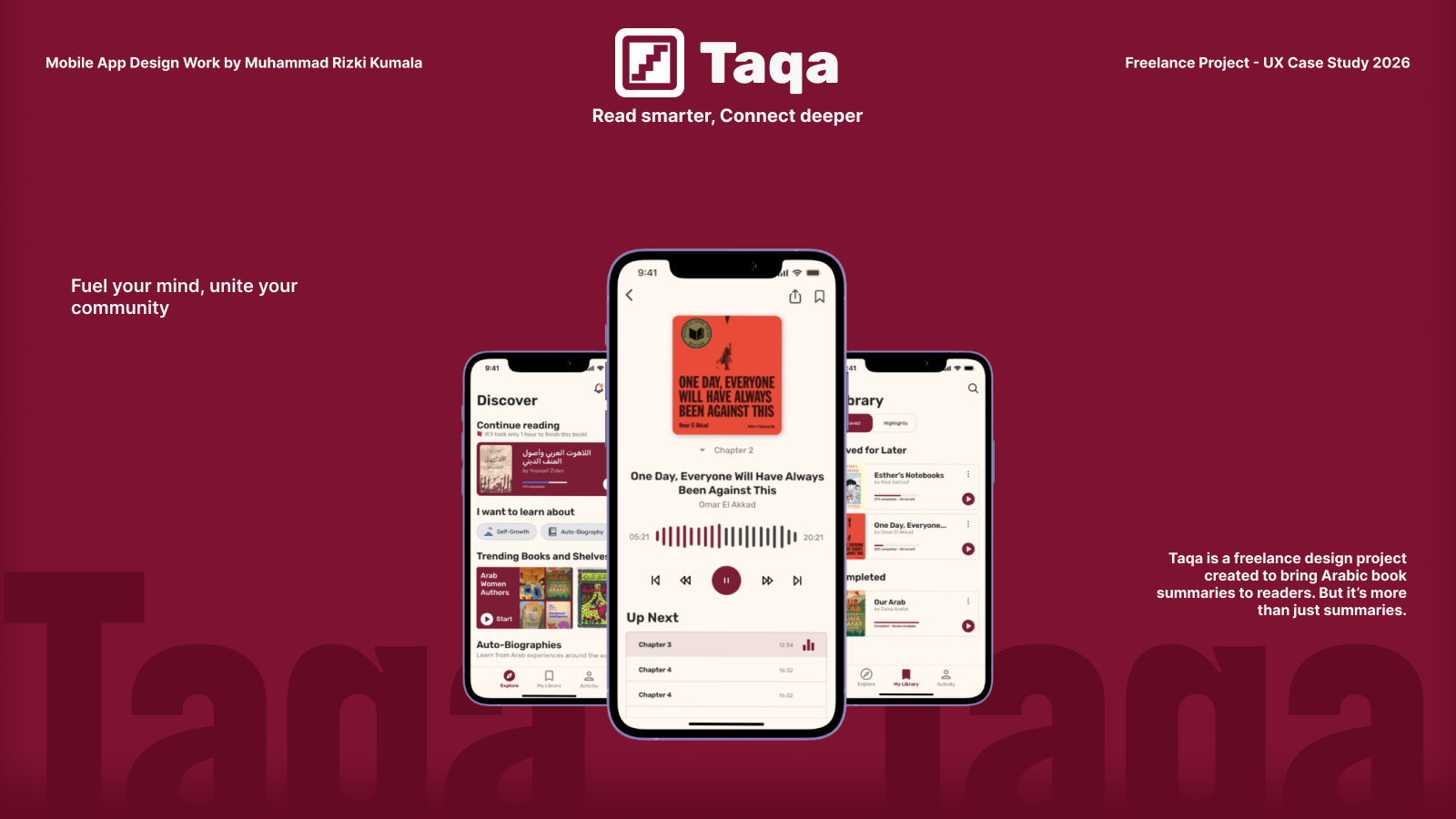
Taqa
Taqa is a book summary app developed as a freelance mobile design project. Built to serve both Arabic and English readers, the core user flows to seamlessly accommodate both languages.
This included tailoring the layout, text hierarchy, and spacing for right-to-left (RTL) Arabic navigation alongside standard left-to-right (LTR) English, creating a visually polished and intuitive reader experience across both versions.
Background
This project represents one of my earliest freelance UX design initiatives. Working directly with a client, I was tasked with taking their vision of an Arabic, Headway-inspired book summary platform—and bringing it to life. Core concepts and foundational background were established by the client, I had creative ownership over the visual identity, naming, and end-to-end user experience, culminating in Taqa.
The name Taqa (طاقة), translating to "energy" or "potential", captures the transformative spark that comes from knowledge and reading.
Goals
Taqa aims to:
- Democratize Knowledge: Provide Arabic and English readers with accessible, bite-sized book summaries.
- Bridge Languages: Deliver a seamless dual-language UX, effortlessly balancing right-to-left (RTL) Arabic and left-to-right (LTR) English interfaces
- Drive Social Impact: Integrate charitable initiatives and local events alongside personal learning goals.
- Enhance Accessibility: Utilize clear visual hierarchies, modern Arabic typography, and intuitive navigation tailored natively to Arabic readers.
Research
User Research
User research was done differently to assist in visualizing the subject for the client, and focused on the consumption habits and social behavior of Arabic and English bilingual readers. Industry research indicates that time constraints are the largest barrier to consistent reading, with up to 75.7% of surveyed readers citing a lack of time despite 85.5% expressing a strong desire to read more (Al-Jarf, 2023).
Qualitative interviews revealed two critical user pain points: 1) native Arabic speakers felt isolated by apps that forced Arabic content into clunky, left-to-right (LTR) interfaces rather than dedicated right-to-left (RTL) systems, and 2) less than 10% of digital readers belonged to active reading clubs or communities, leaving a clear appetite for bridging short-form learning with real-world social impact and events.
Competitive Analysis
To streamline the design process and assist in producing a better design structure and user-flow, competitive analysis was done earlier in the ideation step. The main inspiration for the app was Headway, which excel at short-form audio and text summaries with gamified progress tracking, but function entirely as single-player experiences. Furthermore, their localization for non-Latin scripts often results in broken visual hierarchies and poor Arabic typography.
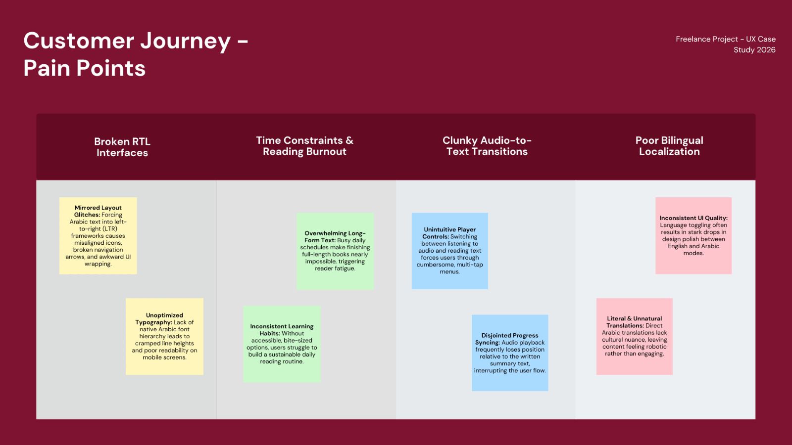
Findings and Synthesis
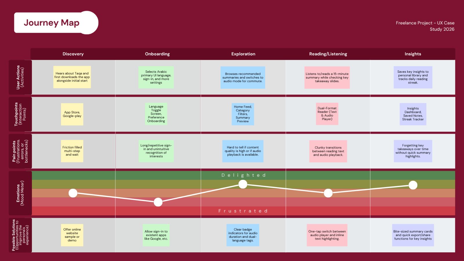
Through this process, I mapped out critical user friction points, such as broken right-to-left (RTL) navigation, unoptimized typography, and cumbersome audio-to-text transitions, that native Arabic readers regularly face.
User Persona
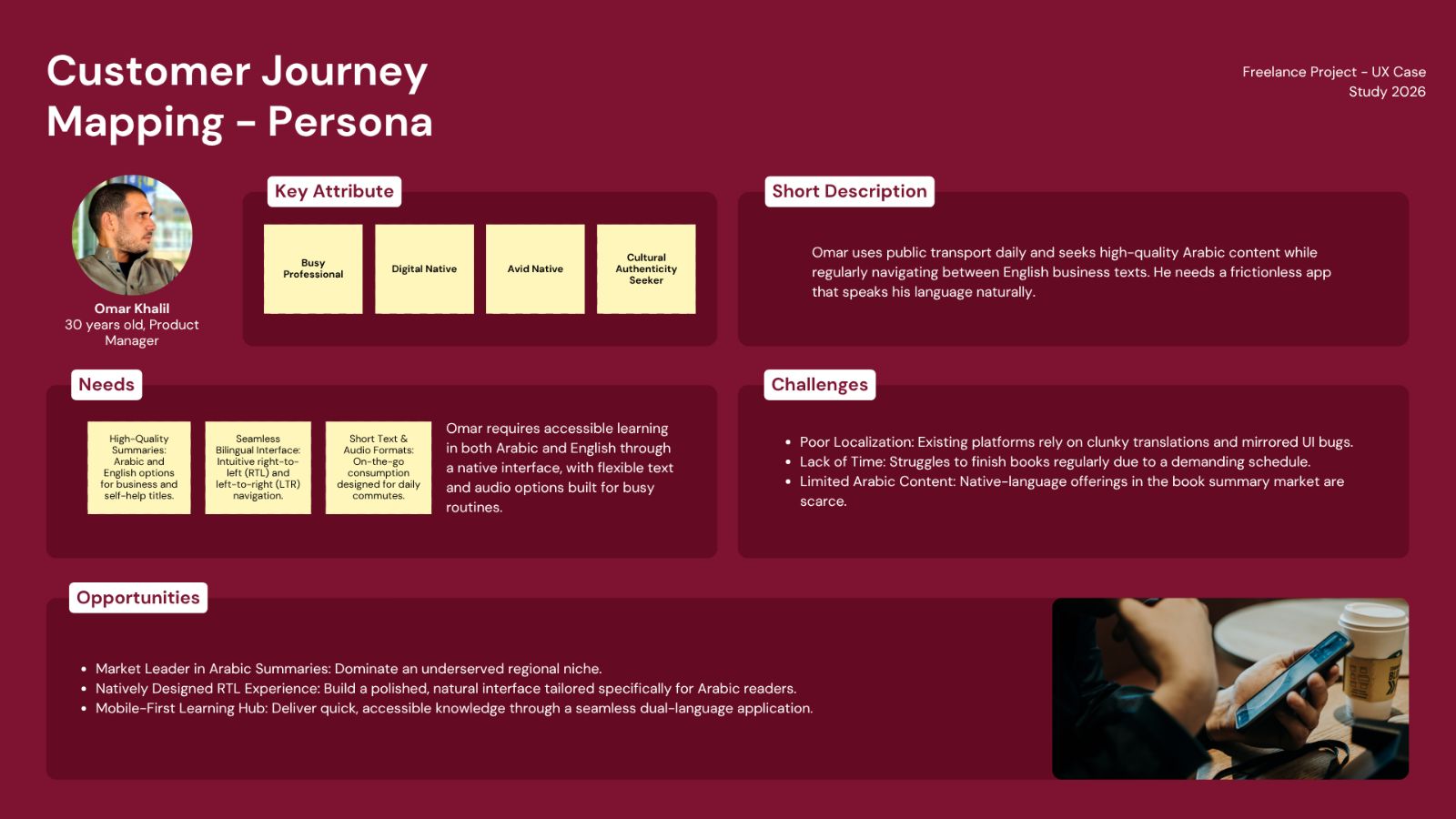
Journey Map
Designing the App
Ideation and Wireframing
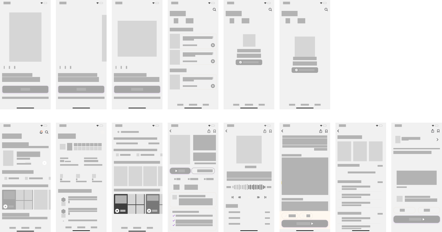
Using the insights gathered during research, I explored ways to simplify how users discover, join, and participate in local communities.
Digital Wireframes
Early Mockup Screens
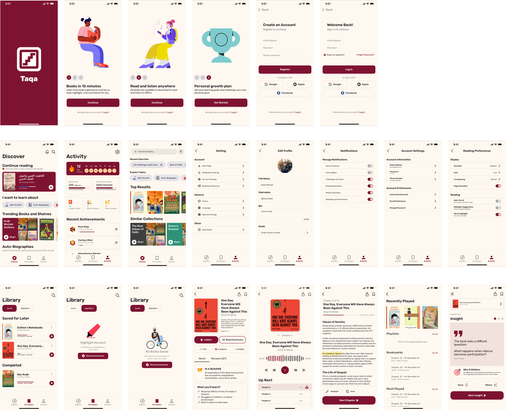
Lo-Fi Prototype and Initial Testing
The testing phase was streamlined as per clients request to focus more on feedback loops. Instead of broad end-user testing, I conducted structured stakeholder interviews and iterative check-ins using low-fidelity prototypes. This allowed us to quickly align on the core user flows, validate the layout logic, and refine screens without spending excessive time on preliminary visual details.
Interactive Hi-Fi Prototype
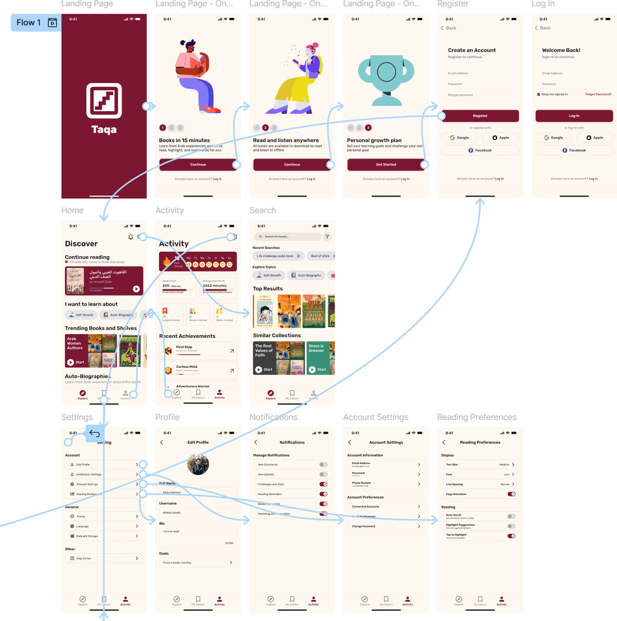
The final high-fidelity designs expanded to cover the complete app scope, delivering a polished visual system built specifically for both Arabic and English readers. Before locking in the final deliverables, we ran one targeted usability test on the high-fidelity prototype to verify that the flow and app felt completely natural.
Key findings from the study are:
- 5/5 participants went through the app from Home -> Insight without assistance.
- Participants easily understood the simple user flow.
- Some users asked for reviews or rating systems to be more visible.
- Majority of the users have asked for more visibility or accessibility options for reading (dark mode etc.).
Live prototype can be found here.
This quick final validation step allowed one final revision and preparation for handoff to the client, and starting the creation of a handoff bundle containing a documented design system, style guide, and annotated screen dimensions.

Final Look
Sticker Sheet and Details
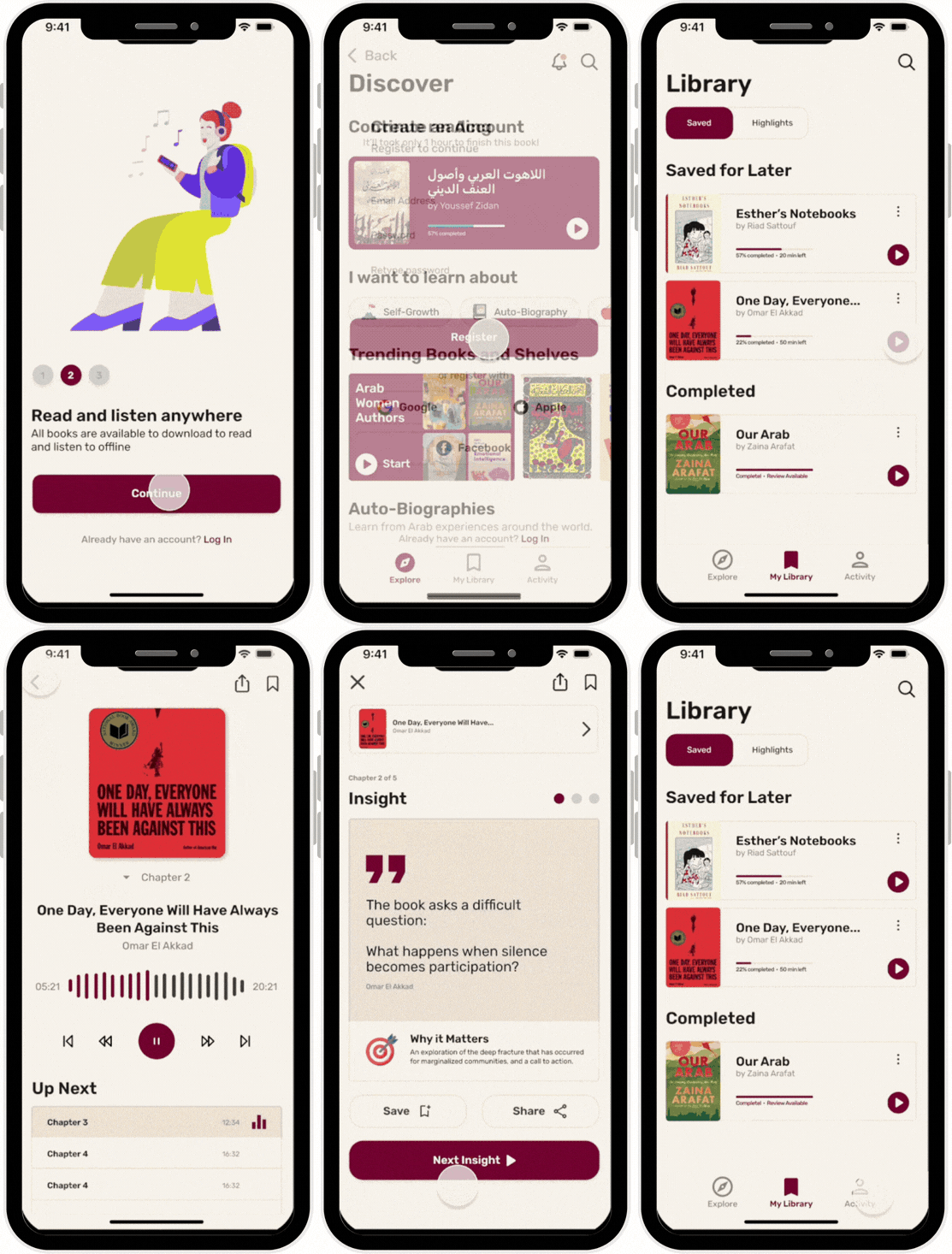
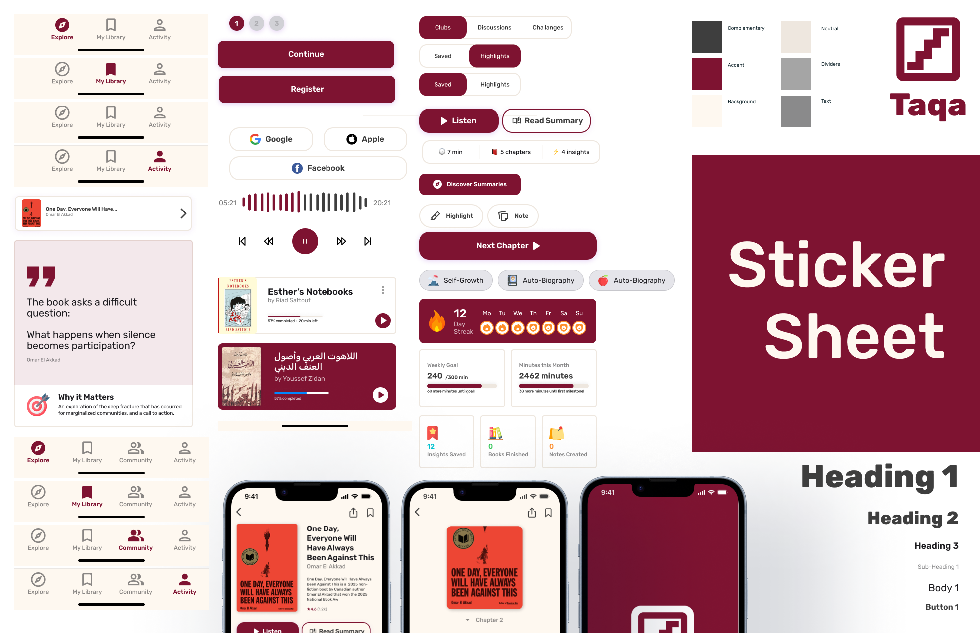
A modular design system was maintained for visual consistency across screens. It includes flexible UI components and audio controls alongside summary cards engineered to adapt effortlessly to both RTL and LTR layouts.
Final Design
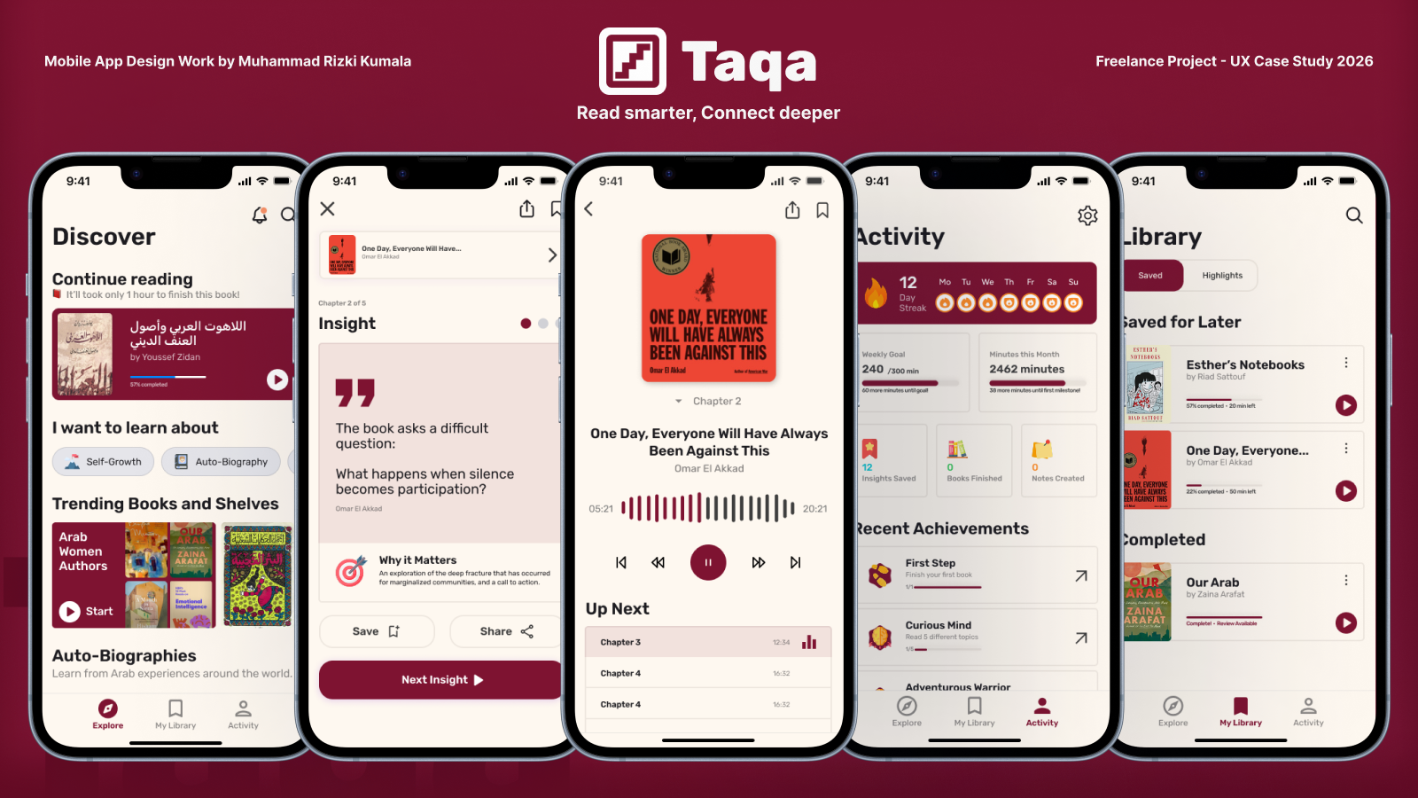
The high-fidelity UI delivers a polished, content-first experience native to Arabic and English readers. Key features include seamless switching between text and audio summaries, clear time indicators, and intuitive right-to-left navigation designed from the ground up for quick daily learning.
Reflection and Afterthought
Working on Taqa reinforced the critical importance of designing for different layouts and keeping in mind the language differences in design thinking. As one my earliest projects in a fast-paced freelance timeline with stakeholder check-ins, the iterative testing can yield highly refined products. Looking back, I am grateful for the opportunity in learning and projects that my work has done and am looking forward to do even more.