
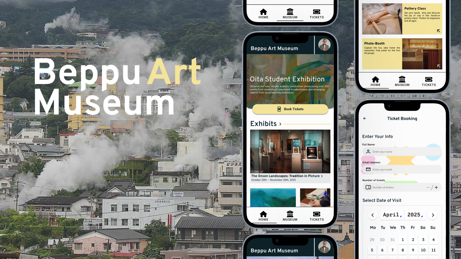
Beppu Art Museum App
As part of the Google UX Design Professional Certificate, I selected this problem statement and designed a solution as my very first UX case study.
This project was initially completed in a 3-month journey and later revisited during my UX learning journey, where I intermittently worked on additional projects and applied those skills to refine and improve this case study.
Problem Statement
Planning trips can often feel fragmented and exhausting, especially within smaller travel destinations where information and ticketing systems are limited or inconsistent. In places like Beppu, users frequently have to navigate multiple websites to discover attractions, view exhibitions, and reserve tickets.
Research surrounding museum and tourism applications also highlights broader usability issues within existing digital museum experiences. Many museum platforms suffer from poor discoverability, unclear navigation, and friction-heavy booking systems that discourage user engagement.
This project explores how a more integrated and user-centered mobile experience could simplify museum discovery, improve ticket purchasing, and create a more accessible and engaging visitor journey.
Goals
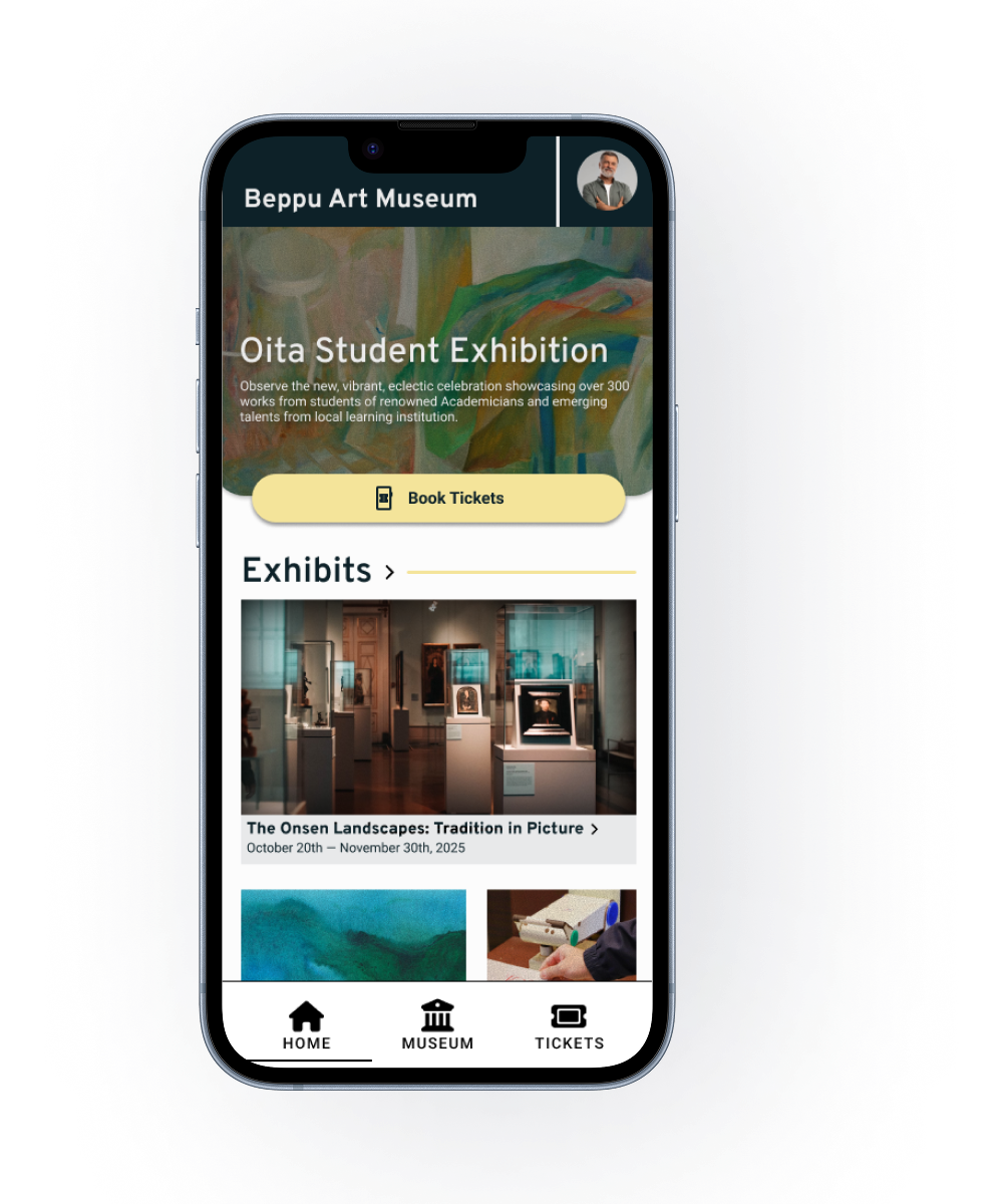
The primary goal of the app was to simplify the process of discovering exhibitions, accessing important museum information, and booking tickets efficiently for travelers visiting Beppu.
The project also aimed to:
- Reduce friction within the booking experience
- Improve accessibility and clarity of information
- Encourage spontaneous museum visits through stronger event visibility
- Build a modern and welcoming digital museum experience
Research
Background
This project began from my personal interest in both travel and the arts. While my earliest solution focused mainly on functionality and simplicity, revisiting the project later allowed me to approach the experience more critically and identify deeper usability problems within museum and tourism platforms.
Through additional UX learning and iterative redesigns, I refined earlier decisions, introduced stronger research practices, and developed a more thoughtful and user-centered solution.
Research Findings
The research process included secondary research, competitor analysis, and interviews conducted with close friends and relatives who regularly visit museums, exhibitions, or tourist attractions.
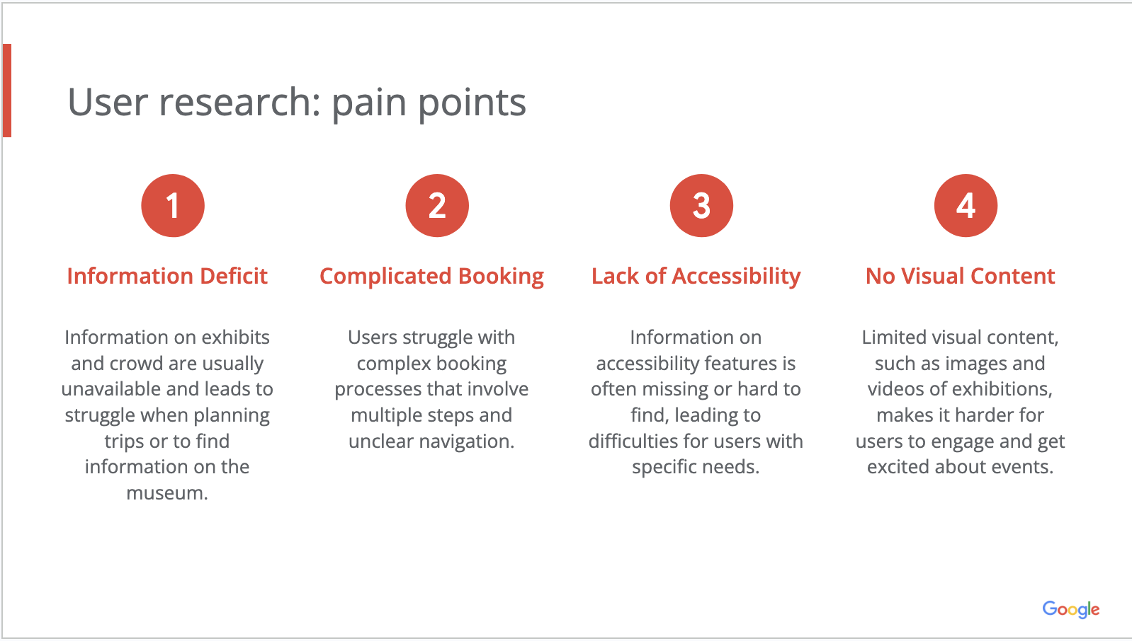
Initially, I assumed users primarily cared about exhibition information and scheduling convenience. However, the interviews revealed that users also valued fast access to practical information such as crowd levels, accessibility details, and visual previews of exhibitions before committing to a visit.
These findings helped shape the direction of the app and highlighted several recurring pain points.
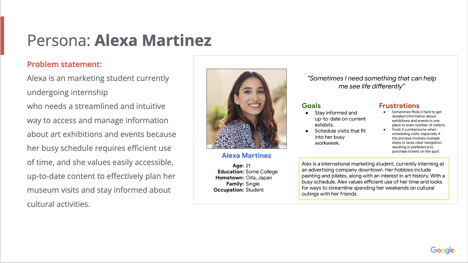
User Persona
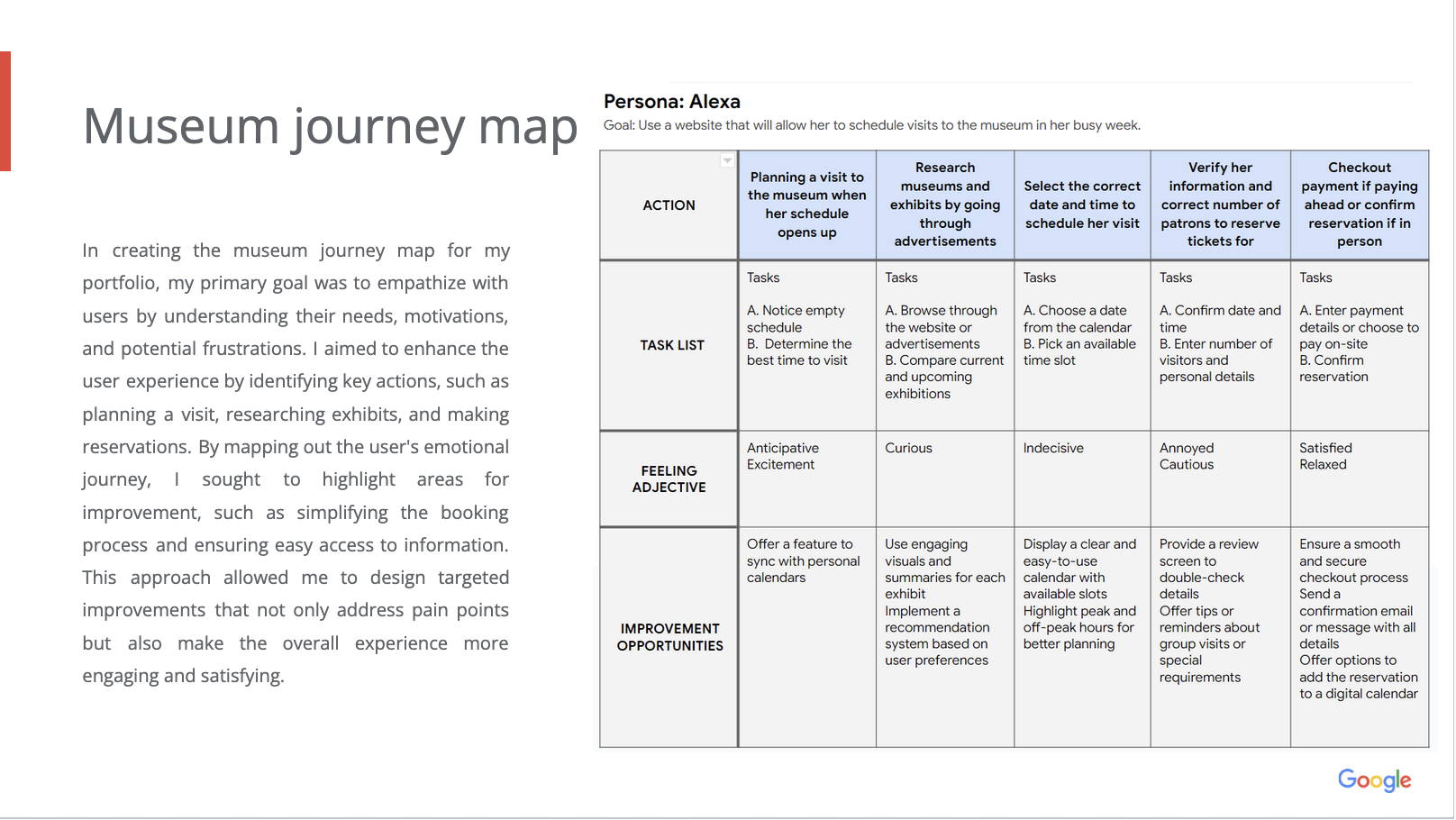
Journey Map
Designing the App
Competitive Analysis
To better understand existing museum experiences, I analyzed several museum and tourism platforms to identify common user flows, interaction patterns, and usability issues.
While many platforms provided visually appealing experiences, several struggled with fragmented navigation, hidden accessibility information, and overly complex booking flows. This analysis helped identify opportunities to create a more streamlined and accessible experience focused on convenience and clarity.
Ideation and Wireframing
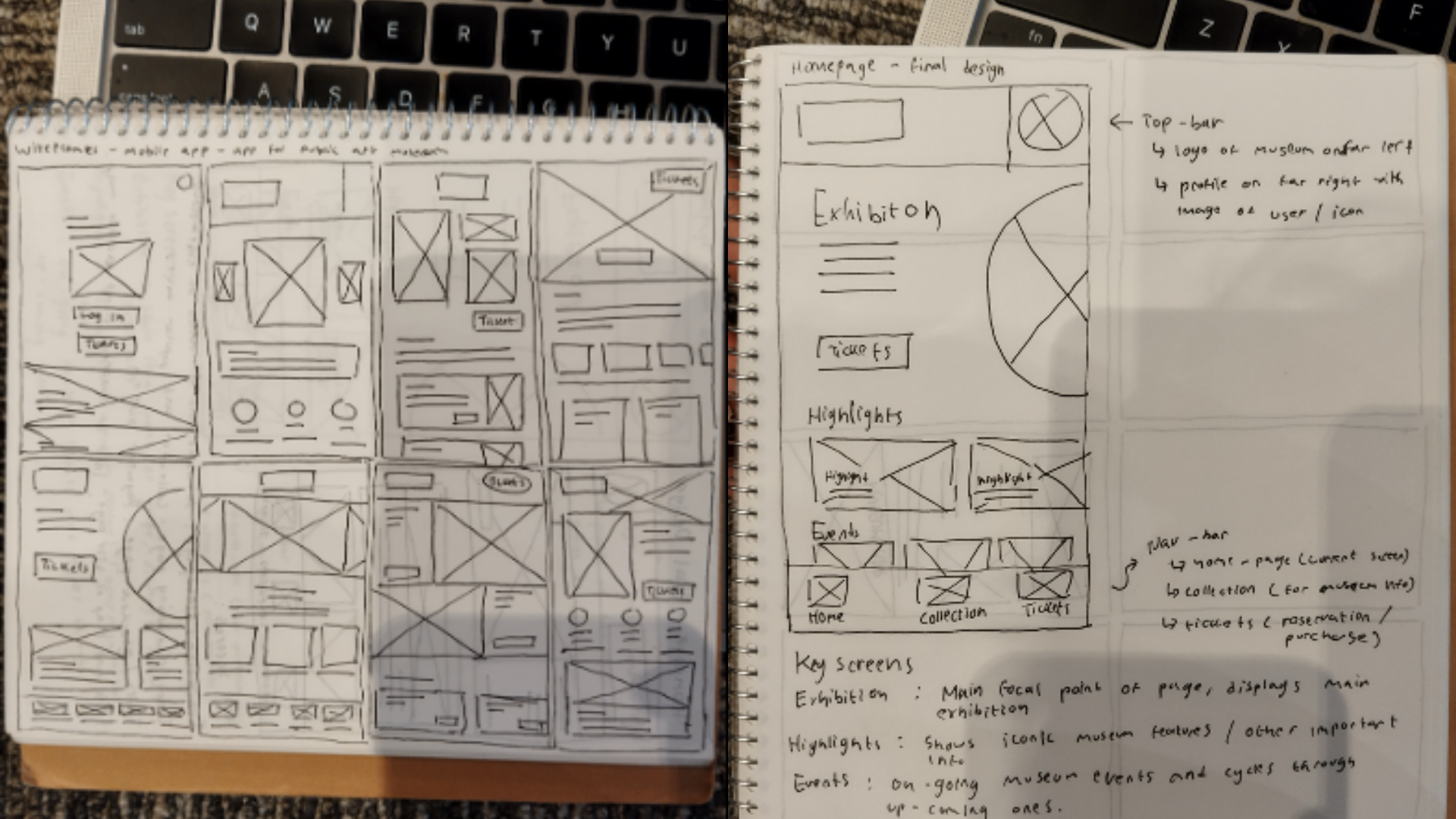
I explored multiple layout directions and navigation structures before arriving at the final design direction. Early iterations focused heavily on reducing unnecessary back-and-forth interactions while making important information easier to access.
Throughout the process, I prioritized:
- Faster exhibition discovery
- Simplified ticket purchasing
- Clearer navigation
- Strong visual hierarchy
- A modern and welcoming atmosphere aligned with the museum experience
Digital Wireframes
Early Mockup Screens
.png)
Lo-Fi Prototype and Testing
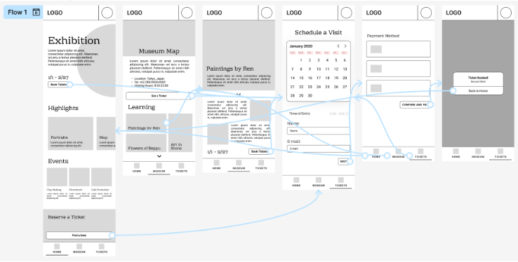
After finalizing the first digital wireframes, I created a low-fidelity prototype connecting the core user flows and conducted usability testing with real users.
The first round of usability testing revealed several recurring issues:
- Users found the booking process confusing
- Filtering and navigation lacked clarity
- Participants responded positively to the guided tour feature
- Users requested integrated maps and clearer artwork navigation
These findings became the basis for the next design iterations and significantly influenced the structure of the final experience.
Hi-Fi Prototype and Testing
Using feedback gathered during the first usability study, I refined the navigation system, simplified the booking flow, and introduced additional features that addressed user frustrations discovered during testing.
The second round of usability testing led to several improvements:
- Simplified and clearer booking interactions
- Introduction of a “What’s On Today” feature for spontaneous visits
- Map-based navigation within guided tours
- Improved accessibility customization
- Artwork preview thumbnails for easier browsing
During the later stages of the project, I also redesigned the payment and checkout flow after identifying issues related to readability, visual hierarchy, and user trust during form completion.
These revisions focused on creating a cleaner and more reassuring purchasing experience through improved spacing, alignment, and visual guidance.
Live prototype can be found here.
.png)
Final Look
Branding and Details
The visual identity for the app was designed to feel modern, accessible, and welcoming while still maintaining the atmosphere expected from an art museum experience.
To improve the experience, I overhauled the layout, alignment, spacing, and confirmation screens to create a cleaner and more reassuring checkout process that felt both visually polished and easier to navigate. These final iterations helped create a more cohesive and professional overall experience across the app.
.png)
Final Design
The final visual direction was designed to feel modern, calm, and accessible while still reflecting the atmosphere of a contemporary art museum.
The interface focused on:
- Clean and intuitive navigation
- Readable and accessible layouts
- Strong visual hierarchy
- Exhibition-focused imagery
- Minimal friction throughout booking and discovery flows

Reflection
This project became much more than my first UX case study. Revisiting it over time allowed me to see how both my design process and decision-making evolved through experience and feedback.
One of the most valuable lessons I learned was how important iteration and usability testing are in shaping better user experiences. Early testing sessions revealed weaknesses in my initial assumptions and taught me how to separate personal preference from actual user needs.
Looking back, the difference between the earliest prototype and the final iteration is substantial. More importantly, the project helped me build confidence in conducting research, refining interfaces through feedback, and approaching UX problems with a more thoughtful and user-centered mindset.


(1).jpg)