
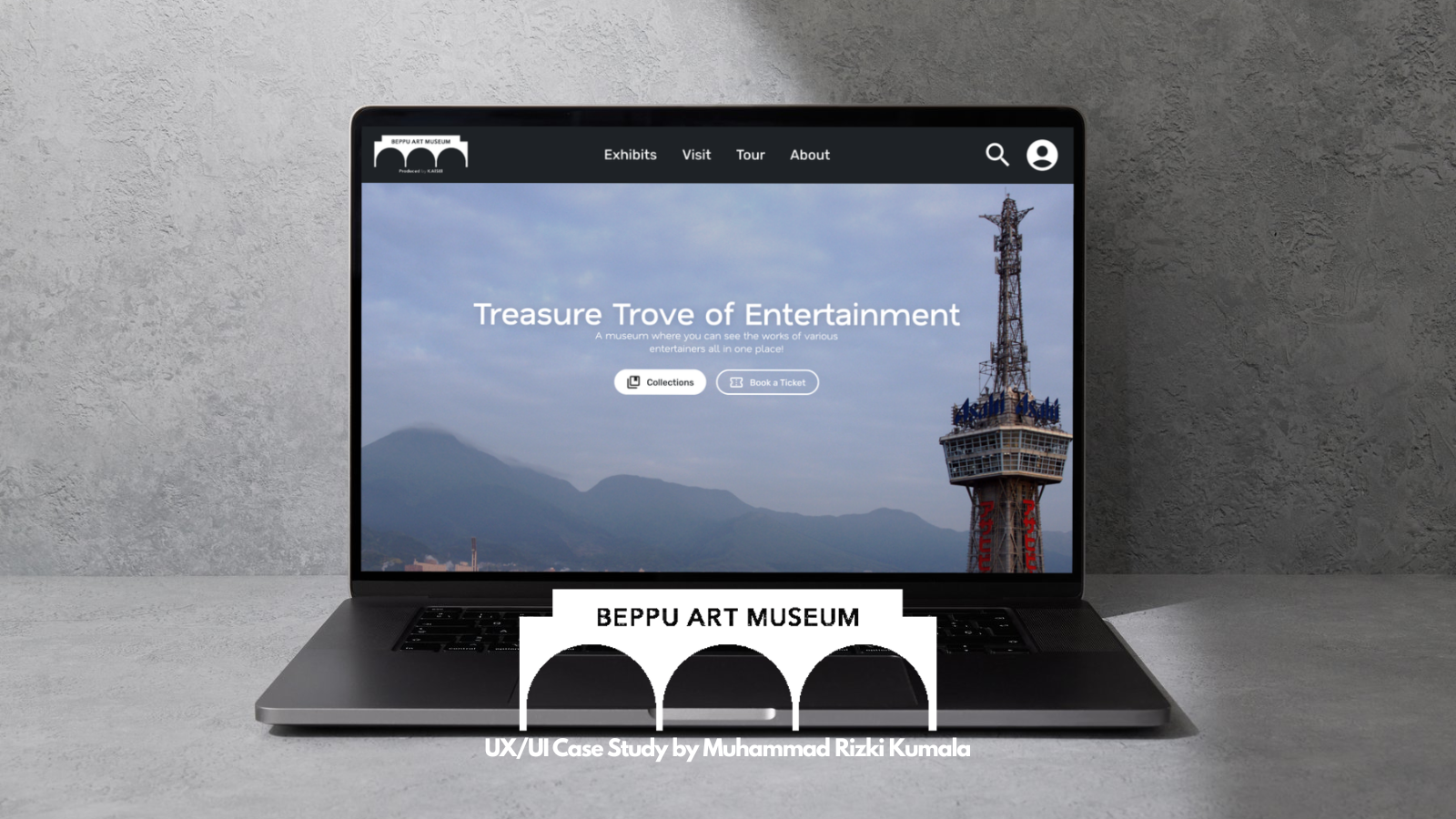
Beppu Art Museum Website
As part of the Google UX Design Professional Certificate, I reiterated my previous work in the Beppu Art Museum application and created a full responsive website displaying my full knowledge and experience in the course.
This project was completed in the span of a month, with research taking from previous studies beforehand.
.png)
Problem Statement
While the original mobile app focused on creating a streamlined on-the-go museum experience, many users still relied heavily on desktop platforms when researching destinations, comparing exhibitions, or planning trips in advance.
Museum websites often overwhelm users with fragmented navigation, inconsistent layouts, and information-heavy interfaces that make discovering exhibitions or booking tickets unnecessarily complicated. Additionally, responsive experiences across devices are frequently inconsistent, causing friction when transitioning between desktop and mobile interactions.
This project explores how a responsive and unified museum platform could create a more seamless experience across devices while maintaining clarity, accessibility, and ease of navigation.
Goals
The responsive website aimed to:
- Adapt the museum experience across desktop, tablet, and mobile platforms
- Improve content discoverability through clearer layouts and navigation
- Simplify ticket booking and exhibition browsing on larger screens
- Utilize findings from previous usability studies to refine interaction patterns and information hierarchy
- Create a cohesive and visually engaging museum experience across devices
Research
Building on Previous Research
Unlike the original mobile app project, this redesign primarily relied on insights and usability findings collected during earlier research and testing phases.
Through the previous usability studies, several recurring user behaviors became increasingly clear:
- Users preferred faster access to exhibitions and ticket information directly from the homepage
- Navigation clarity became more important as content volume increased
- Visual previews significantly improved user engagement and browsing confidence
- Users wanted better accessibility visibility and clearer event organization
- Larger layouts created opportunities for stronger visual storytelling and information hierarchy
These findings became the foundation for restructuring the experience specifically for responsive web platforms.
Challanges
Transitioning from mobile-first design to a responsive web experience introduced several new design considerations:
- Balancing large amounts of information without overwhelming users
- Maintaining consistency across breakpoints
- Adapting navigation systems for desktop and tablet interactions
- Utilizing larger screen spaces effectively without losing clarity or focus
- Preserving the simplicity of the original mobile experience
These challenges shaped many of the design decisions throughout the project.

Designing the App
Competitive Analysis
To better understand responsive museum and tourism experiences, I reviewed several museum websites and cultural institution platforms across desktop and tablet interfaces.
While many websites successfully showcased exhibitions visually, several suffered from:
- Overly dense layouts
- Hidden booking systems
- Inconsistent responsive behavior
- Poor accessibility communication
- Difficult navigation across multiple categories and exhibitions
This analysis helped identify opportunities to create a cleaner, more structured experience focused on usability and discoverability.
Ideation and Planning for Responsiveness
The redesign process focused heavily on restructuring information architecture and adapting interactions across screen sizes.
I explored several layout directions that prioritized:
- Faster access to current exhibitions
- Clearer separation between information categories
- Stronger visual hierarchy
- Simplified ticket booking flows
- Improved readability on larger displays
Special attention was given to ensuring that important information remained accessible and consistent regardless of device size.
Digital Wireframes
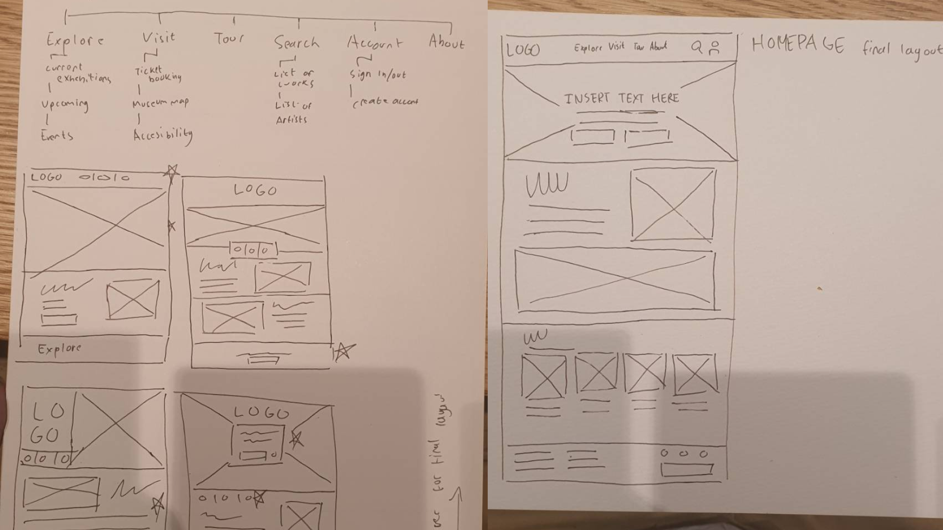
Early Mockup Screens
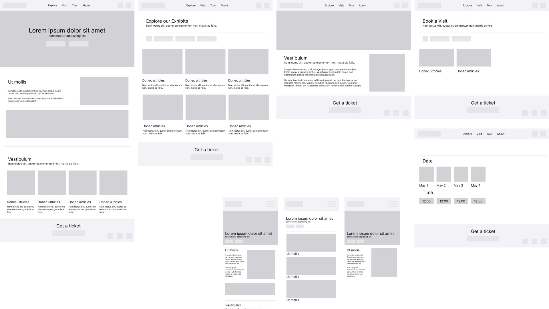
Prototyping & Iteration
After finalizing the responsive wireframes, I developed high-fidelity responsive mockups across desktop, tablet, and mobile breakpoints.
Several features from the original mobile experience were expanded and refined during this process:
- Exhibition previews became more visually prominent
- Homepage layouts were redesigned to better highlight current events and featured exhibitions
- Navigation systems were simplified for larger screen interactions
- Accessibility information became easier to locate throughout the experience
- Ticket booking flows were streamlined to reduce unnecessary steps
The responsive redesign also introduced more flexibility in browsing behavior, allowing users to discover information more naturally across different screen sizes.
Final Look
Final Design
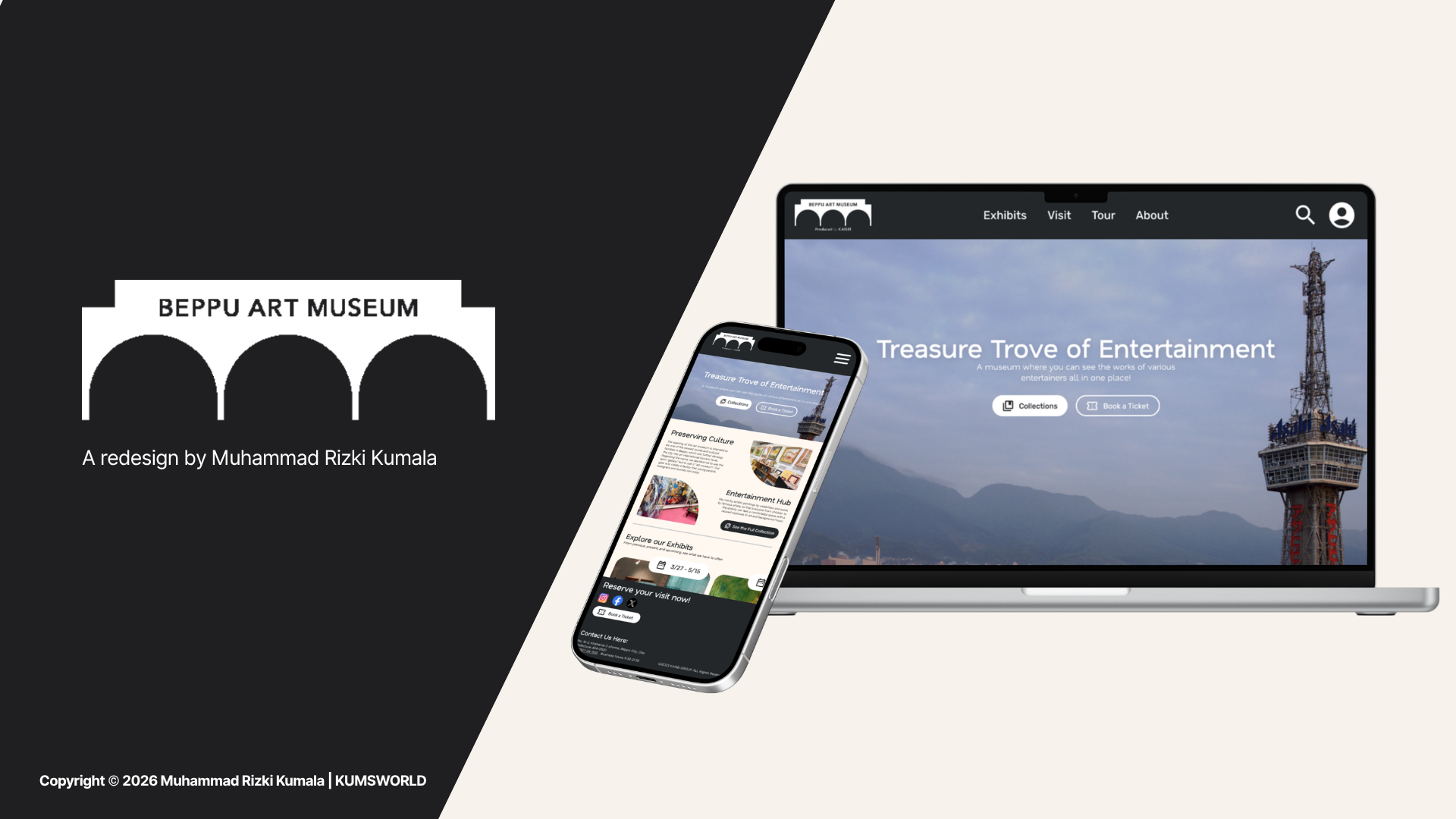
The final responsive experience was designed to feel immersive, modern, and highly accessible while maintaining the calm and welcoming atmosphere established in the original mobile app.
The interface focused on:
- Clear and structured layouts
- Consistent responsive behavior across devices
- Accessible typography and spacing
- Exhibition-focused visual storytelling
- Minimal friction throughout browsing and booking flows
By utilizing larger screen spaces more effectively, the redesign allowed users to engage more deeply with exhibitions and museum information without sacrificing simplicity or usability.
Reflection
This project allowed me to better understand the differences between designing for mobile-first experiences and creating fully responsive systems across multiple devices.
One of the biggest lessons I learned was that responsive design involves much more than resizing interfaces. Different devices encourage different browsing behaviors, priorities, and expectations, which required me to rethink navigation, content hierarchy, and interaction patterns throughout the experience.
Revisiting the BAM project again also highlighted how valuable earlier usability testing had become. Rather than restarting the process entirely, I was able to build upon existing research insights and apply them more thoughtfully within a responsive environment.
Overall, this project strengthened my understanding of responsive UX systems, information architecture, and designing experiences that remain cohesive across multiple platforms.


(1).jpg)